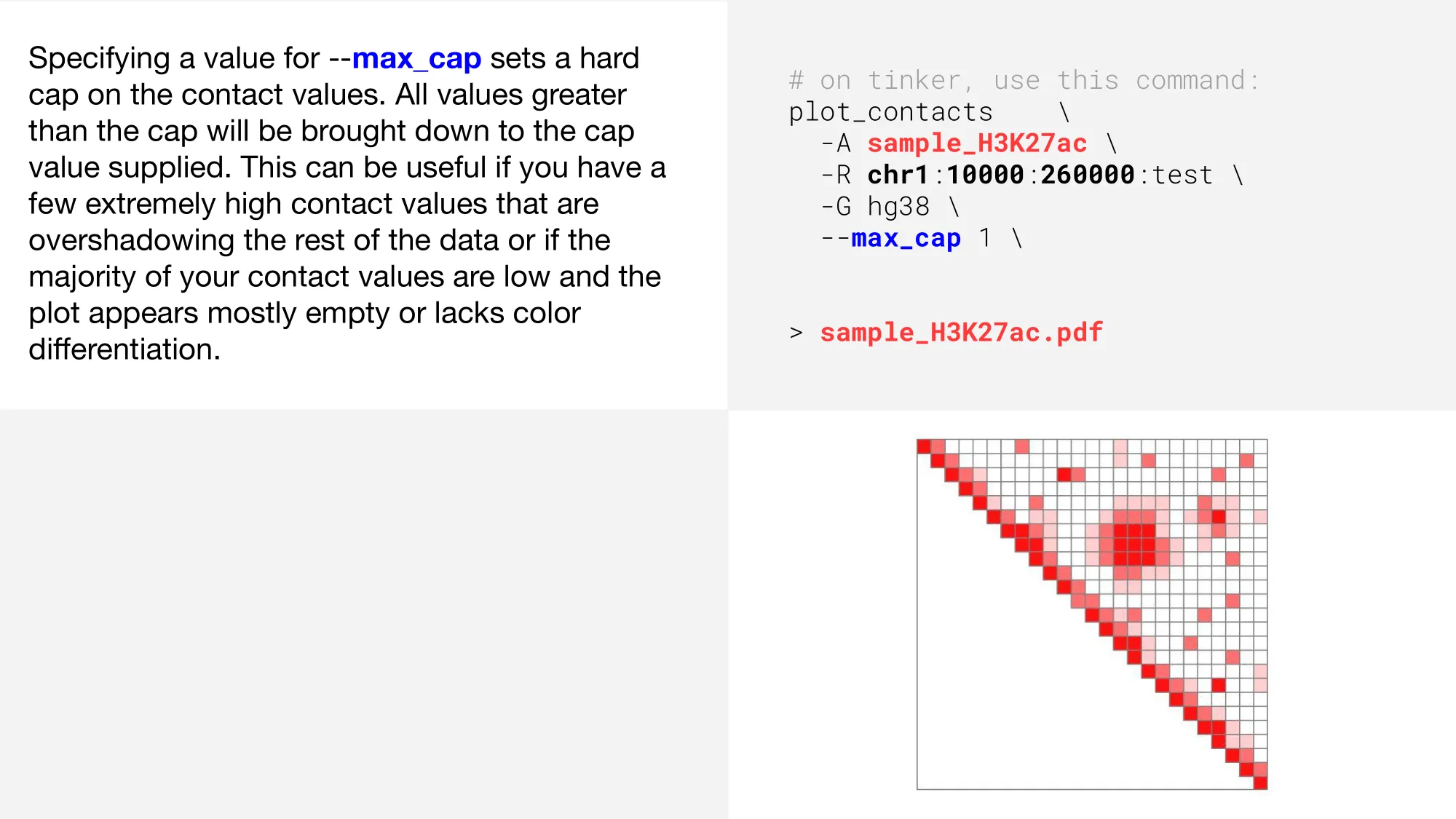
Concepts
plot_contacts often rounds out the pipeline as the last tool to be used. The visualizations it offers can be likened to hypothesis tests; they not only depict the adjustments made by preceding tools, but can also illuminate areas that may require further modification. This allows researchers to both fine-tune their approaches and generate publication-ready figures. plot_contacts is a robust tool with many optional parameters. For a full list of parameters, type plot_contacts -h into your tinker box and check out the plot_contacts tool tutorial here.
Vanilla plot
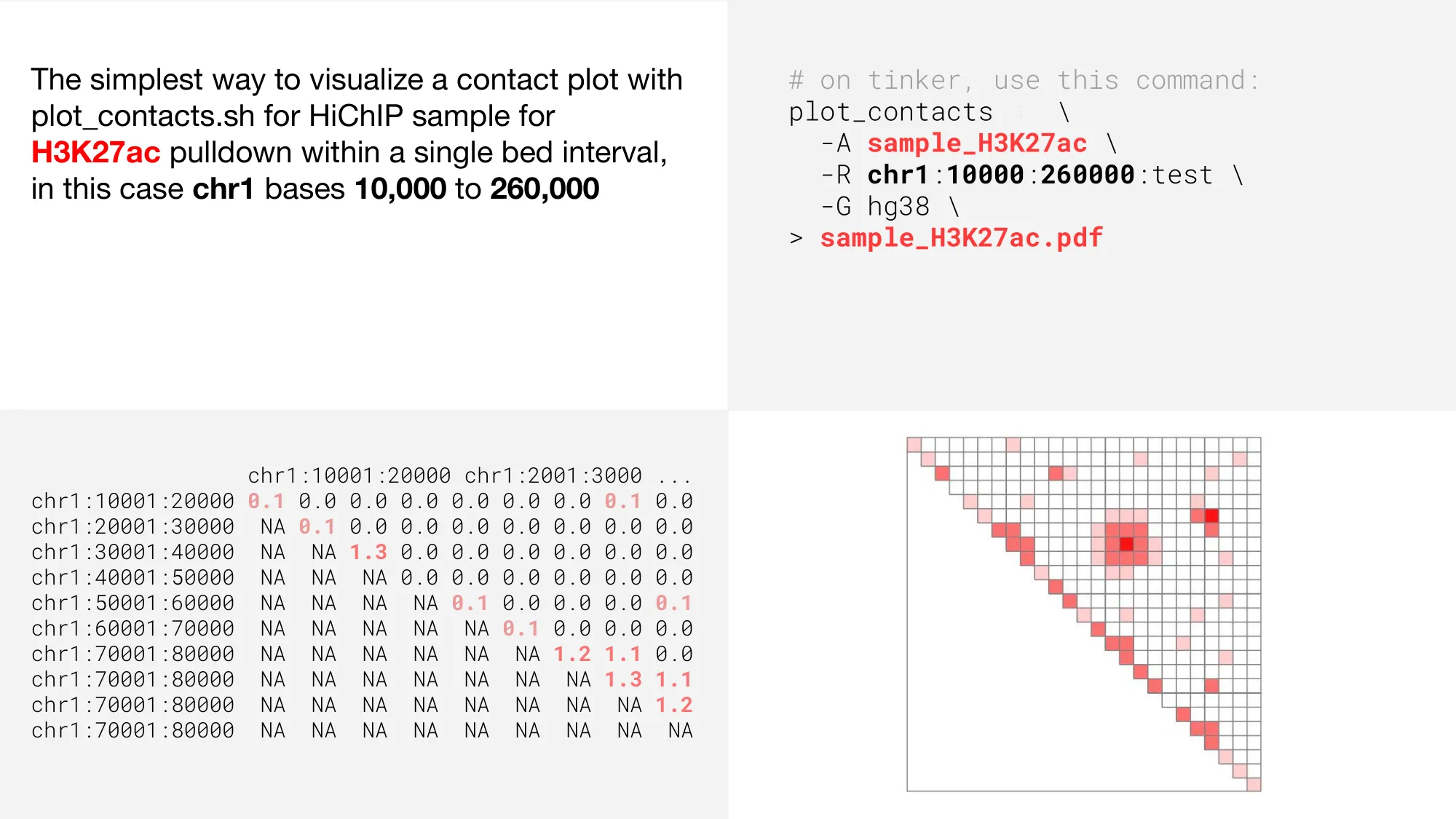
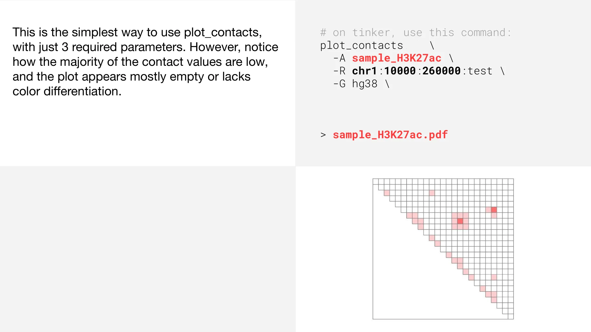
We’ll start this concept tutorial by looking at the simplest way to use plot_contacts with only 3 required parameters.
Downloading plots
As you can see, the plot is a graphical representation of the upper triangle of a contact matrix. Once the code has finished executing inside the tinker box, you can view and download the pdf by copying it into the shared-files folder, like so: cp sample_H3K27ac.pdf ~/shared-files
Click here to learn more about the capabilities of the shared-files folder.
Changing resolution
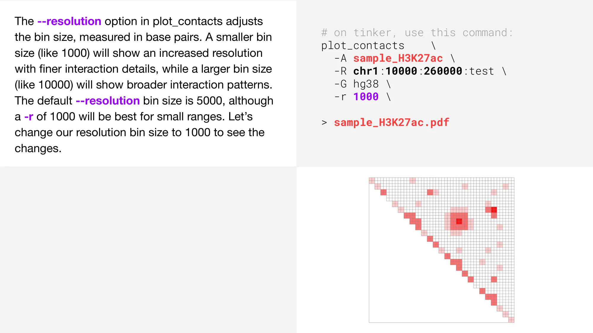
Perhaps a bit counter-intuitive at first, decreasing the --resolution parameter will provide a finer, more granular plot. This is because the numeric value for --resolution refers to the number of base pairs per bin. Therefore, a bin with only 1000 base pairs will be a more detailed visualization compared to a bin with 5000 base pairs.
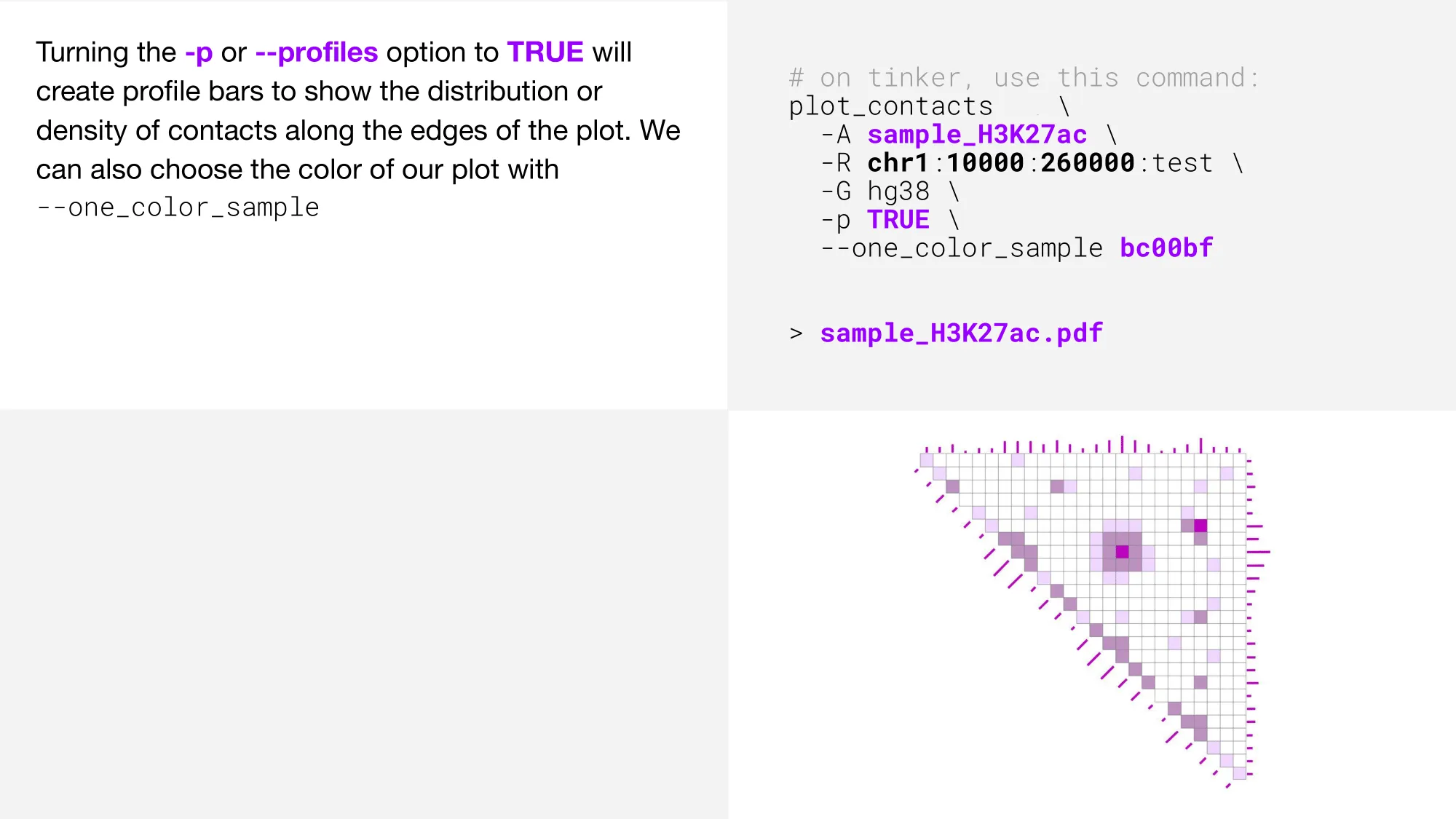
Adding profile bars
Changing color intensity
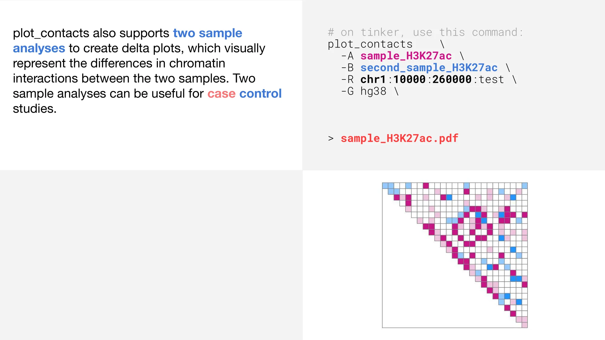
Two sample analyses