Examples
This is a tool-oriented primer designed to guide you through the functionalities of plot_contacts. From your tinker box, type -h into the command window and press enter to view the help message.
Help message
plot_contacts -h

Create contact plots with CPM/AQuA normalized contact values

--------------

OPTIONS
-A|--sample1                        : Name of sample you want to use to create the contact plot, name it as it appears on the Tinker box
-R|--range                          : The genomic range that is to be plotted, in chr:start:end:tag format. For example: -R chr1:40280000:40530000:MCC7_MYCL
-G|--genome                         : The genome build the sample has been processed using. Strictly hg19 or hg38
[  -O|--output_name             ]   : Optional: provide a name for the plot
[  -B|--sample2                 ]   : For two sample delta plots, name of the second sample
[  -Q|--norm                    ]   : Which normalization to use. Strictly 'none', 'cpm' or 'aqua' in lower case. Non-spike-in samples default to cpm. Spike-in samples default to aqua.
[  -r|--resolution              ]   : Resolution of sample in basepairs. Default 5000. Accepted resolutions: 1000,5000,10000,25000,50000,100000,250000,500000,1000000,2500000
[  -p|--profiles                ]   : If contact profiles should be drawn along the diagonal, x axis and y axis. Default = FALSE
[  -o|--color_one_sample        ]   : Color for contacts for single sample plots in RGB hexadecimal, ex: red = FF0000 (RRGGBB). Default = FF0000
[  -t|--color_two_sample        ]   : Color for contacts for two sample plots (delta) in RGB hexadecimal separated by '-', ex: 1E90FF-C71585
[     --annotations_default     ]   : Draw bed annotations; TSSs, ENCODE 3 enhancers, CpG islands. Default = TRUE
[     --annotations_custom      ]   : Path to bed file to draw custom annotations. Only one custom bed supported
[     --annotations_custom_color]   : Color for supplied bed in RGB hexadecimal, ex: C71585
[     --quant_cut               ]   : Between 0.00-1.00. Rather than using the max value of the matrix as the highest color, cap the values at a given percentile. Default 1.00
[     --max_cap                 ]   : Set a hard cap, all values greater than this will be brought down to cap value supplied.
[     --use_dump                ]   : TRUE or FALSE. Obtain raw contact matrices along with contact plot. Default FALSE
[     --bedpe                   ]   : Supply path to a bedpe file to highlight tiles of interacting bedpe feet
[     --bedpe_color             ]   : Color for supplied bedpe in RGB hexadecimal. ex: C71585
[  -i|--inherent                ]   : TRUE or FALSE. If TRUE, normalize the contact plot using inherent normalization
[  -w|--width                   ]   : Manually set width of printed bin between 0-1. Default width calculated automatically.
[  -g|--gene                    ]   : Provide a gene name to automatically select TAD coordinates for interval range (-R).
[  -h|--help                    ]   : Help message. Primer can be found at [https://rb.gy/fjkwkr](https://rb.gy/fjkwkr)
Let’s tinker with plot_contacts using provided sample data in your tinker box. First, let’s assign some variables.
sample1=RH4_DMSO
range=chr16:790000:1260000:SOX8
genome=hg38
Naming & viewing pdf
Now let’s visualize our chosen range from our sample by running the following command. We will use -O to specify the name of our plot. Once the code has finished executing, we will access it for viewing and/or downloading by copying it into the shared-files folder. More information about the shared-files folder can be found here
plot_contacts
  -A $sample1 \
  -R $range \
  -G $genome \
  -O pc_test.pdf

cp pc_test.pdf ~/shared-files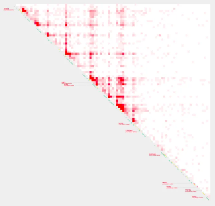
Changing color intensity
We have two options to alter how the contact values in the plot are represented in terms of color intensity. Specifying a value for --max_cap sets a hard cap on the contact values. All values greater than the cap will be brought down to the cap value supplied. This can be useful if you have a few extremely high contact values that are overshadowing the rest of the data or if the majority of your contact values are low and the plot appears mostly empty or lacks color differentiation.
Similarly, --quant_cut is also used to determine the highest color intensity in the contact plot.
Rather than using the maximum value of the contact matrix as the highest color intensity, the --quant_cut option allows you to cap the color intensity at a given percentile of the data.
The value for this option should be between 0.00 and 1.00. For instance, if you set --quant_cut to 0.95, then the 95th percentile of the data will be treated as the maximum value for coloring purposes. All values above this percentile will be represented with the same color as the 95th percentile.
Let’s bring down the max value with --max_cap
plot_contacts
  -A $sample1 \
  -R $range \
  -G $genome \
  --max_cap 1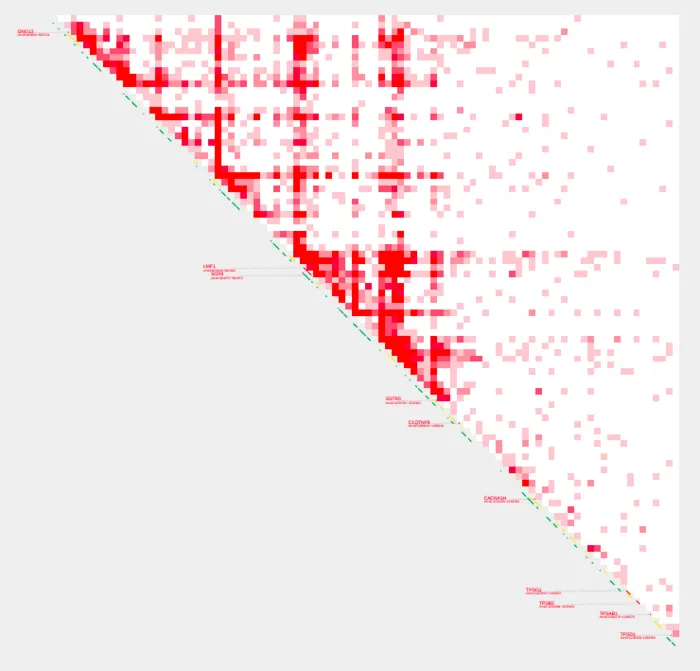
We can also bring down max values using quantiles with --quant_cut
plot_contacts
  -A $sample1 \
  -R $range \
  -G $genome \
  --quant_cut 0.95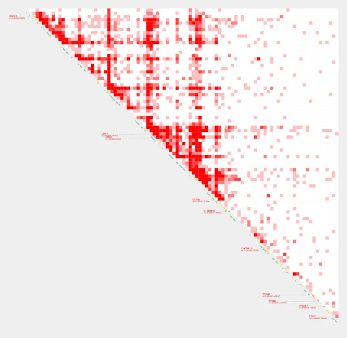
Plotting genes by TAD
Alternative to specifying a range with -R, we can supply a gene name with -g or --gene to define a genomic region of interest. Instead of specifying exact genomic coordinates, you provide a gene name. The tool then automatically selects the Topologically Associating Domain (TAD) coordinates or relevant interval range associated with that gene.
plot_contacts
  -A $sample1 \
  -g RXRA \
  -G $genome \
  -O rxra.pdf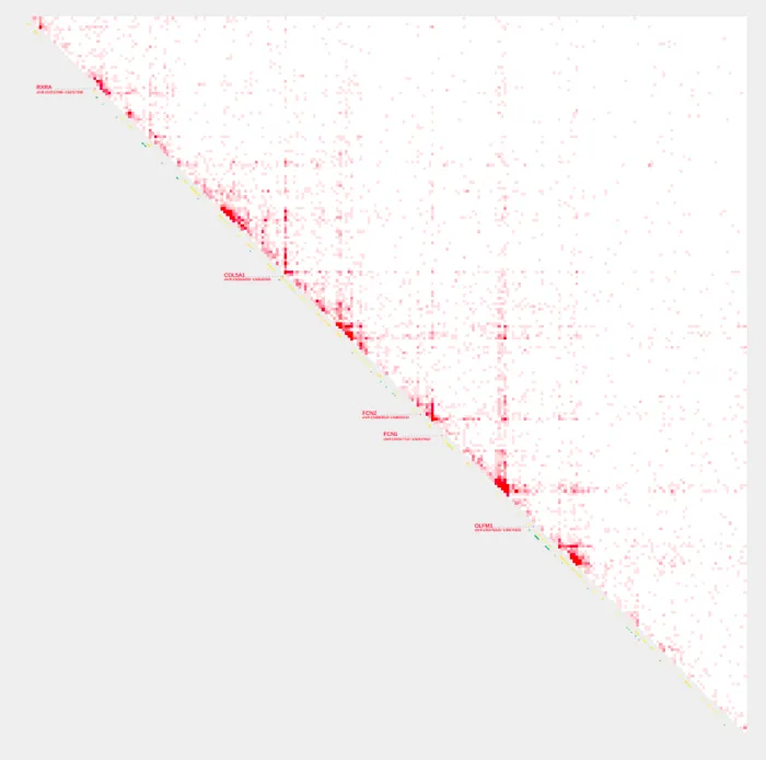
Normalization methods
There are several normalization methods we can use with plot_contacts, including CPM (Counts Per Million), AQuA (Absolute QUantification of chromatin Architecture), and Inherent Normalization (Note: Inherent Normalization is only available for some one-sample analyses). Users can also opt for no normalization to work with raw contact values.
plot_contacts
  -A $sample1 \
  -R $range \
  -G $genome \
  -O PC_4.pdf \
  -Q cpm \
  --max_cap 1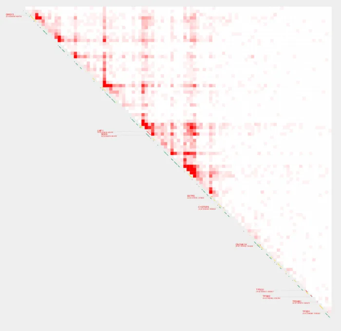
Changing the default color
We can change the color of the contact plot using --color_one_sample. Let’s change the plot color and use aqua normalization.
plot_contacts
  -A $sample1 \
  -R $range \
  -G $genome \
  -O PC_5.pdf \
  --max_cap 1 \
  -Q aqua \
  --color_one_sample c000ff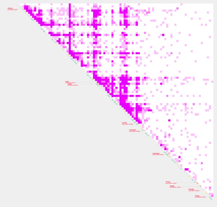
Changing the default resolution
The --resolution option in plot_contacts adjusts the bin size, measured in base pairs, used for chromatin interaction data. A smaller bin size like 1,000 base pairs offers increased resolution with finer interaction details, while a larger bin size like 5,000 base pairs presents broader interaction patterns. The default --resolution bin size is 5000, however a resolution bin size of 1000 will be best for small ranges. Let’s change our resolution bin size to 1000 to see the changes.
plot_contacts
  -A $sample1 \
  -R $range \
  -G $genome \
  -O PC_6.pdf \
  --max_cap 0.6 \
  -Q aqua \
  --color_one_sample c000ff \
  --resolution 1000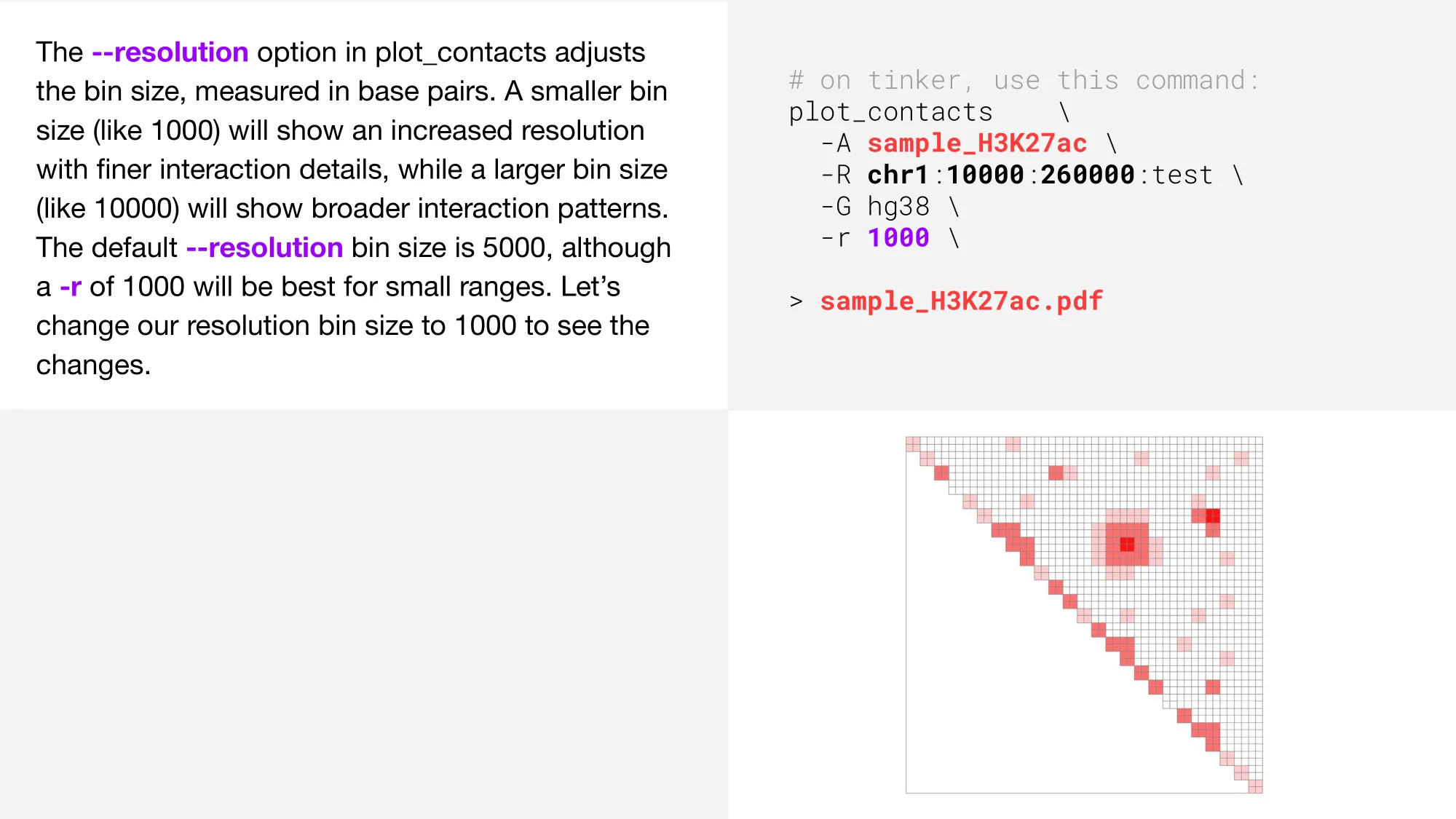
Adding profiles bars
Profile bars can quickly show the distribution or density of contacts along a chromosome or genomic region. We can use --profiles TRUE to add profile bars to our plot.
plot_contacts
  -A $sample1 \
  -R $range \
  -G $genome \
  -O PC_7.pdf \
  --max_cap 0.4 \
  -Q aqua \
  --color_one_sample c000ff \
  --resolution 5000 \
  --profiles TRUE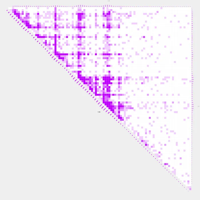
Default and custom annotations
The default settings for annotations_default is TRUE. This means that by default, TSSs, ENCODE 3 enhancers, and CpG islands will be displayed as annotations along the diagonal. However, turning --profiles TRUE will disable the default annotations to avoid label and profile overlap. In addition to --annotations_default, we can also add --annotations_custom which will display genomic annotations on the contact plot by providing a path to a custom BED file. The color of the custom annotations is controlled with --annotations_custom_color. In the following example, --annotations_custom and --annotations_custom_color will create a gray line that extends the length of the diagonal.
annotation=~/lab-data/hg38/reference/TAD_goldstandard_lift.hg38.bed

cat $annotation | head

chr1   984620  1304620 5
chr1   1314620 1524620 4
chr1    918561 2148561 6
chr1   2188561 2388561 7
chr1   2408561 2568561 4.5
chr1   2793435 3433436 6
chr1   3443436 3743436 5.5
chr1   3935209 5919940 6
chr1   5989940 6669940 7
chr1   6689940 8349940 7

plot_contacts
  -A $sample1 \
  -R $range \
  -G $genome \
  -Q aqua \
  --max_cap 1 \
  --color_one_sample c000ff \
  --annotations_custom $annotation\
  --annotations_custom_color 5f5f5f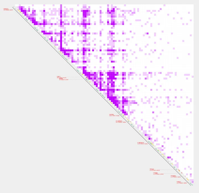
Two sample analyses
plot_contacts also supports two sample analyses to create delta plots, which visually represent the differences in chromatin interactions between the two samples. Two sample analyses can be useful for case control studies. In the following example, we’ll visualize two sample analyses with profiles, annotations, and colors.
sample1=RH4_DMSO_GSM3414981
sample2=RH4_HDACi_GSM3414982
plot_contacts
-A $sample1 \
-R $range \
-G $genome \
-Q aqua \
--quant_cut 0.8 \
--profiles TRUE \
-B $sample2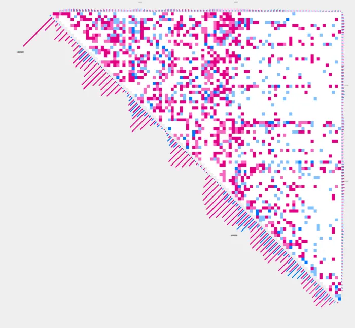
plot_contacts
  -A $sample1 \
  -R $range \
  -G $genome \
  -Q aqua \
  --quant_cut 0.8 \
  --annotations_custom $annotation \
  --annotations_custom_color 5f5f5f \
  -B $sample2 \
  --color_two_sample 644bbe-6d5f00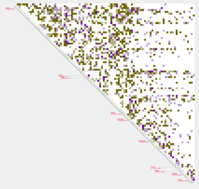
Highlighting a bedpe region
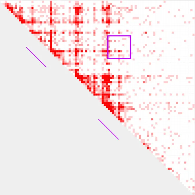
If you’d like to highlight specific tiles of interacting regions, you can use --bedpe and --bedpe_color. This functionality is described in detail in the query_bedpe code tutorial found [here]([query_bedpe](/docs/Tutorials/Tool Tutorials/build_bedpe)).
Relationship between range, resolution, and bin width
All plots generated with plot_contacts use a variable w to determine what size each bin should be on the output pdf page. w is calculated automatically based on the supplied range and resolution. In most cases, the automatically calculated w will generate the best looking visualization. However, there may be rare cases where a user would like to manually control the width of the bins printed in the output pdf. For this, a user can specify the bin width with the parameter -w. -w should usually fall within the range of 0.25 - 1.5, depending on range and resolution.
If a user supplies a very large range, or a very fine resolution, w may become very small and generate a poor visualization. On the other hand, if a user supplies a very small range and uses the default resolution of 5000 or larger, w may become very large and also generate a poor visualization. If either of this situations occur, a user will receive a message in the terminal while the plot is generating. This message will suggest either increasing or decreasing the resolution and/or range. The value of w will be printed as part of the processing output as plotting bin width: . If you receive one of the help messages in your processing output, or generate a poor visualization, it is worth taking a look at the value of w to determine the best course of action.
plot_contacts \
-A $sample1 \
-G $genome \
-R $range \
-w 0.5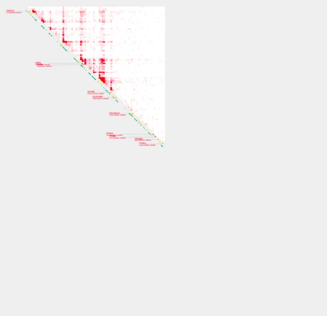
plot_contacts \
-A $sample1 \
-G $genome \
-R $range \
-w 1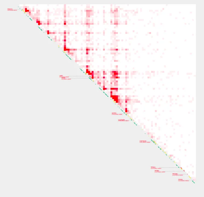
If we try to manually assign a w value that will result in a plot that is too large to fit on the page, we will get a message informing us of the maximum w allowable given the supplied range and resolution.
plot_contacts \
-A $sample1 \
-G $genome \
-R $range \
-w 1.5

Commencing single_sample analysis
resolution: 5000
switch to R

No bedpe supplied to highlight contact plot

interval
interval_chr:   chr16
interval_start: 790000
interval_end:   1260000
interval_tag:   SOX8

factors
norm_factor: 0.033532
aqua_factor: 5.552412

straw parameters
norm: NONE
hic: /home/ubuntu/lab-data/hg38/RH4_DMSO_GSM3414981/RH4_DMSO_GSM3414981.allValidPairs.hic
interval: chr16:790000:1260000
unit: BP
bin_size: 5000

User-supplied -w value is too large for the given range and/or resolution. The
maximum -w acceptable for these parameters is 1.052632

plotting bin width: 1.5

Drawing default annotations